


Designing the Checkout Experience: What Users Should See and What Businesses Need to Know
- Nov 10, 2025
- 5 min read
When visitors reach your checkout page, they’re moments away from deciding whether to trust you with their money. Even if you’ve done everything right up to this point, beautiful layout, excellent copy, and engaging visuals, an unclear or clumsy checkout can break that trust instantly.
For many small business owners, designers, and freelancers, the checkout may seem like a technical afterthought. But in reality, it’s one of the most strategic parts of your website. The way you design your checkout directly affects whether users complete the purchase, feel safe providing card details, and return in the future.
This guide walks through what customers should see and what business owners need to include from the cart summary to the confirmation page. So every transaction feels smooth, compliant, and professional.
The Cart or Booking Summary
The cart or booking summary for services is the first signal of transparency. It’s where users verify exactly what they’re paying for, what it costs, and what’s included. Any confusion here creates hesitation and potential abandonment.
Think of it as your final conversation with the client before they make a decision. The more precise you are, the less room there is for doubt.
Show every product or service line, quantity, and price.
Clearly list taxes (like IVA in Italy), shipping, or service fees.
Provide “Edit” or “Remove” buttons to let users make last-minute changes.
Keep the design clean, avoid distractions, and bright banners that pull focus from the order.
Example: If you’re a photographer selling digital prints, your cart should list the image size, resolution, and total price, along with a brief note stating that VAT is included.
In Brief:
Display full order details and pricing.
Be transparent with all taxes and fees.
Use mobile-responsive tables for clarity.
Offer an “Update Cart” or “Back to Shop” link.
Pros | Cons (if ignored) |
Builds trust instantly | Users abandon unclear carts |
Reduces refund disputes | Hidden fees damage credibility |
Reinforces professionalism | More customer-support messages |
Protip: Always display the total cost, including VAT or service charges, before payment. EU and Italian law both require price transparency.
The Checkout Form
After reviewing their cart, the user moves to the checkout form. This is where compliance and user experience meet. The goal is to collect only the information you truly need while making the form effortless to complete.
Under GDPR (General Data Protection Regulation), you’re legally required to minimize personal data collection. Ask only for details relevant to completing the order—no more, no less. For example, if you’re selling digital downloads, you don’t need to request a physical address.
Organize your form so that it feels intuitive: start with personal details, then move on to payment details, and conclude with confirmation. Use autofill and dropdowns to save time and prevent typos.
Key Takeaways:
Collect essential data only (name, email, billing info).
Group related fields logically and label them clearly.
Use SSL (encrypted) forms to secure entries.
Include privacy policy and cookie links near the “Pay Now” button.
Pros | Cons (if ignored) |
Faster checkout process | High abandonment rates |
Legal data-collection compliance | Risk of GDPR violations |
Better accessibility | User frustration from long forms |
Protip: Guide users visually. Progress indicators (“Step 2 of 3”) reduce anxiety by showing how close they are to finishing.
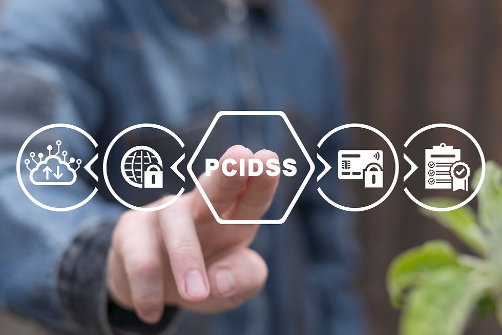
Payment Method Selection
This is the stage where most customers pause. They’re about to share sensitive information, and any hesitation can cause them to quit. The design here must communicate security and familiarity.
Display recognizable payment options such as Stripe, PayPal, or Satispay, all of which comply with the Payment Card Industry Data Security Standard (PCI DSS)—the global rule for protecting card data through encryption.

Avoid redirecting users to unfamiliar third-party sites whenever possible; on-site checkouts usually convert better. Always ensure your website uses HTTPS (the small padlock in the browser), which confirms that data is encrypted.
In Brief:
Offer at least two trusted payment options.
Display card-network logos for reassurance.
Use PCI DSS-compliant gateways only.
Avoid manual or email-based payments.
Pros | Cons |
Increases trust and conversions | Unrecognized gateways cause drop-offs |
Legally compliant | Risk of fraud if insecure |
Supports multiple currencies | Too many choices can overwhelm |
Protip: Add a short note near the payment fields, such as “Your transaction is encrypted and GDPR-compliant.” This simple line reinforces credibility.
Confirmation Page and Receipts
A clear confirmation page reassures customers that their payment was successful. It’s also your opportunity to show professionalism and compliance.
Your confirmation page should immediately display:
An order or booking number.
A summary of the purchase.
Your contact email or support link.
An estimated delivery or next-step message.
For Italian businesses, integrate fattura elettronica (electronic invoicing) through the SDI – Sistema di Interscambio, Italy’s government-run digital-invoice exchange. Most modern gateways, including Stripe, can connect to accounting tools that automatically send invoices.
Key Takeaways:
Provide instant confirmation and follow-up email.
Offer a downloadable invoice or receipt.
Use bilingual (Italian/English) messages for accessibility.
Provide clear next-step instructions (e.g., shipping, appointment, download).
Pros | Cons (if ignored) |
Reinforces customer confidence | Users unsure if payment succeeded |
Fulfills Italian invoicing law | More support inquiries |
Opens door to post-purchase marketing | Lost engagement opportunities |
Protip: Automate bilingual confirmation emails. Even a short thank-you note makes your business feel more human and professional.
Accessibility, Localization & Mobile Optimization
A compliant checkout must also be accessible and inclusive. In 2025, the European Accessibility Act will require all online services in the EU to meet accessibility standards, so it’s best to start preparing now.
Ensure that every button, label, and text element is legible, with sufficient color contrast (e.g., dark text on a light background). Allow keyboard navigation for people who can’t use a mouse. Use readable fonts no smaller than 16 px and maintain consistent spacing so forms don’t shift unexpectedly on mobile.
Localization also matters. Italian users expect to see prices in €, labels in Italian, and options such as SEPA (Single Euro Payments Area) transfers. If your site serves international clients, enable language switching and ensure that translations are applied to your checkout as well.
In Brief:
High-contrast design and readable fonts.
Keyboard-friendly form navigation.
Clear language and currency localization.
Responsive layout for mobile devices.
Protip: Add descriptive “aria-labels” for screen readers and alt text for all icons. Accessibility is part of compliance and user care.
Designing Trust Through User Experience (UX)
Effective checkout design is as much about psychology as it is about technology. Users don’t just want safety, they want reassurance. Colors, typography, and tone all influence how confident someone feels before pressing “Pay Now.”
Maintain consistent branding—avoid sudden changes in color or layout.
Use concise, friendly language on buttons (e.g., “Confirm Order” instead of “Submit”).
Avoid pop-ups or exit modals that interrupt the payment flow.
Place trust indicators where users naturally look, such as padlock icons, privacy policy links, or brief security notes near buttons.
A clutter-free checkout reflects a professional, reliable brand. It tells visitors, “You can trust us, we know what we’re doing.”
Key Takeaways:
Consistent branding = credibility.
Minimal distractions = smoother flow.
Clear microcopy builds emotional trust.
Legal links should be easy to find but unobtrusive.
Protip: Blend design and compliance seamlessly. When your checkout looks trustworthy, users rarely question its safety; they feel it.
Quick Glossary
GDPR (General Data Protection Regulation): EU law protecting personal data privacy.
PCI DSS (Payment Card Industry Data Security Standard): Global rulebook for handling and encrypting card data.
SEPA (Single Euro Payments Area): EU bank-transfer system that simplifies euro transactions.
Fattura Elettronica: Mandatory electronic invoice format for Italian businesses.
SDI (Sistema di Interscambio): A government portal used for sending and receiving electronic invoices.
European Accessibility Act: An EU directive that makes accessibility mandatory for digital services, effective starting in 2025.


Comments