Why I Rebranded My Business: Leaving My Own Name Behind
- Jun 20, 2025
- 4 min read
Updated: Jul 16, 2025
The Bold Creative Rebrand That Sets Me Apart

When I first launched my creative studio, my name, Kimberly Vanzi, was prominently featured. From KimberlyVanziDesign.com to KimberlyVanziStudio.com, I was the brand. It worked at first until it didn’t.
The more I grew, the more I noticed something unsettling: a sea of other 'Kimberly' designers flooding the digital space, many even using the same initial ‘K’ as their logo. I wasn’t just blending in, I was vanishing into a generic crowd. That realization sparked a bold, creative rebrand. It was time to relinquish my name and build something distinctly mine.
The Case for Change
Oversaturation of First-Name Brands.
First-name-based branding is popular for a good reason: it's personal, memorable, and approachable. However, differentiation becomes impossible when everyone does it, especially in web and brand design. A quick Google or Instagram search yielded dozens of "Kimberly Design" accounts. My work was unique, but my name wasn’t.
Visual Identity Conflicts
I had initially chosen the letter K as part of my logo. But soon, I saw it echoed again and again. K in script, K in monogram, K with a brushstroke. It lost its impact. That signature letter no longer felt like signature branding, no matter how many design elements I added.
Clients Weren’t Always Finding Me
SEO and digital visibility depend on more than just a polished site. Even your best work can get buried when your brand name is indistinguishable from ten others.
Too long to memorize
Kimberly Vanzi Studio is a mouthful, but my last name, Vanzi, separates me from the others. I needed a brand name that was easier to pronounce and memorable.
The Creation of Creavanzi
I needed a name that carried a unique brand identity, originality, and meaning.
Creavanzi is a fusion of
“Creava” = created
and
“Vanzi” = my last name.
It reflects my creative purpose and personal identity while evolving beyond the limitations of just my name. It’s a brand that can grow with me and is versatile, memorable, and, importantly, available across domains and platforms.
While the name aligns visually with Italian linguistics, I chose it to reflect my professional life and global branding sensibility.
Why I Chose Three Domains
You might wonder—why not just pick one? I must be crazy, right? But the truth is, there’s a strategy in the madness.
I didn't delete the original domain; I redirected it to my primary domain. If I miss a link I have given out or something, the person can still find me.
kimberlyvanzistudio.com actually still exists; why?
Each domain plays a distinct role in my brand presence:
creavanzi.design is my primary site. It directly speaks to my services and signals a design-focused professionalism. It’s the name you’ll see across my marketing and public-facing content. It also adds a little SEO to the URL.
creavanzi.com supports my email and backend systems. It's simple, trusted, and gives me professional credibility in inboxes. An email like kim@creavanzi.com is clean, strong, and scalable. Easy to remember as well
creavanzi.it reflects my working base in Italy and resonates with local clients. It adds a layer of regional authenticity and connects to my identity as an international designer.
Each domain reinforces a different aspect of my brand: creative, professional, and geographically rooted, while keeping everything under the Creavanzi umbrella.
Visual Branding Breakdown
I didn’t just change the name. I redesigned the entire brand experience.
Logo Symbolism
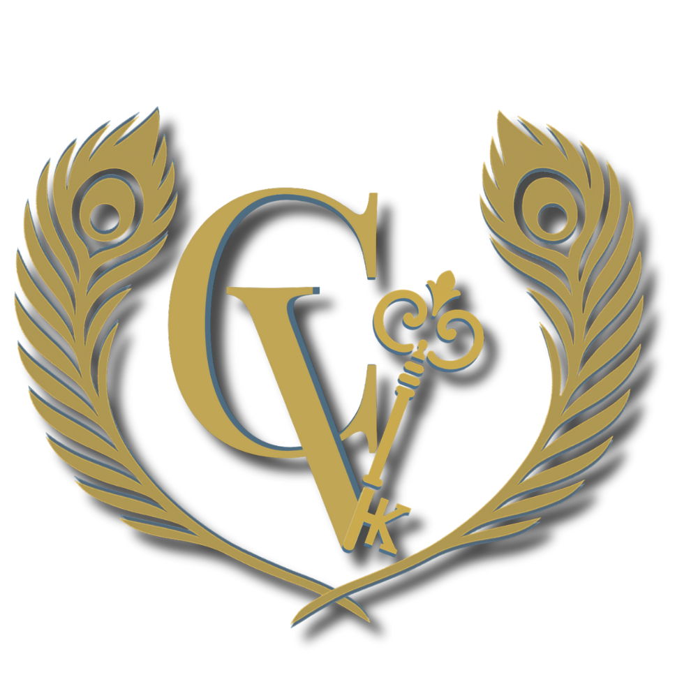
The C and V stand for both Creavanzi and the initials are in a refined serif.
The Key is shaped with a K: A symbolic reference to unlocking creativity, subtly tying back to my first name without relying on it.
The Peacock feathers represent elegance, flair, and uniqueness, traits I bring to every project. If you have been following my journey, you know that my first creation was what moved me more towards my creative side.
Logo Strategy: One Design, Many Uses
A logo isn’t just a stamp. It’s a tool. And tools need variations.
Gold-foil crest: High-impact web presence (think homepages, banners, and hero slides).
Flat monotone: Clean, elegant prints—like letterheads, proposals, and invoices.
Black/White versions: For watermarking, brand partnerships, and low-color environments.
Transparent PNGs: Overlays, videos, product mockups.
Simplified icons: For favicons, browser tabs, and social profiles, clarity at 16x16 pixels is everything.
Each version tells a story, but all are aligned by the same core: elegance, boldness, and adaptability.
Why This Matters for Branding
Your name is powerful, but your identity is more than your name.
Moving beyond my name, I created a brand that speaks louder, stands stronger, and feels more timeless. Creavanzi is easier to remember and leaves room for curiosity. It’s a brand name that invites conversation and storytelling, not just about me, but about the work and impact behind it.
This change wasn’t just aesthetic, it was strategic.
If you’ve ever felt like your brand is getting lost in the crowd, it might be time to rethink what makes you stand out.
Ready for a Brand That Sets You Apart?
Whether you’re building from scratch or feeling boxed in by your current brand, I’m here to help. This was my designer rebrand story. Let's create yours. Book a free consultation today.


Comments